Customized packaging solutions leading to innovations in pastry presentation

Presentation is important, especially for baked goods. As every pastry student will learn, flavor and texture are only two important components to becoming a successful baker. Making your products look tasty and intriguing is the first step in capturing customers’ attention.
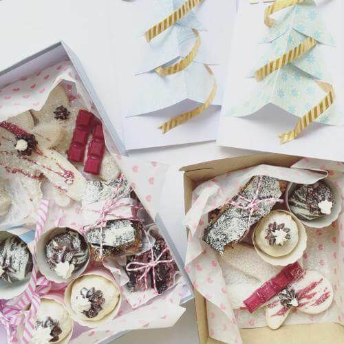
Creating a beautiful pastry may involve creative use of berries and sprinkles, carefully shaped, placed or dripped icing, or other decorative additions to the item itself. However, for consumers shopping for a sweet treat in a grocery store or on an online shop, bakers need to push their creativity beyond their baked goods and into package design. After all, when cupcakes or cookies are packed into a container, it’s not the frosting that customers will see first; it’s the box.
 Using bright, bold colors in package design can capture shoppers’ attention in fun ways.
Bold hues
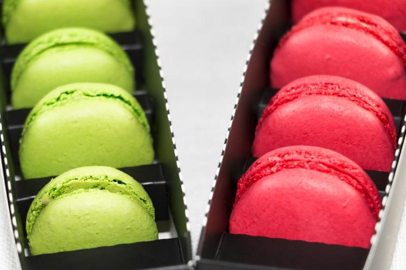
When you want to catch someone’s eye, what better way than to use your favorite bright, bold colors? Shades like blazing yellows, neon greens and hot magentas will stand out against a backdrop of boring, neutral tints. Choose one to coat the whole package in, or color block several to make an interesting pattern.
Some companies, like Jeni’s Splendid Ice Creams, assign particular colors to specific products, choosing to forego brand colors on every package in favor of creating striking patterns that customers are sure to remember. This plays on the psychology of color; if a consumer is drawn to your bright turquoise and electric purple labels one day, they may gravitate toward that same style the next time they’re at the supermarket, 99designs noted.
Clean labels
Though you want an eye-catching design, it’s also important to keep the label clean. Don’t weigh it down with too much information. The clean label trend reflects what customers are really looking for when they’re shopping for treats. While much of the food industry is becoming increasingly health-conscious, people purchasing pastries probably aren’t seeking something very nutritious, Baking Business pointed out.
“Bottom line, people are less focused on ingredients and health when they’re eating sweet goods,” Abby Ceule, director of market management for bread at Corbion Caravan, explained to Baking Business. “When we are looking at sweet goods, we shop with our eyes. People are less likely to turn that package around and see what’s in it.”
While you’ll still need to list ingredients on your package, don’t worry about incorporating listed ingredients into your design unless it makes sense. Beyond the ingredients, customers don’t want to be loaded down with details. Keeping just the basics on the label and brightening it up with some simple decals can attract the eye without overloading the mind.
Sneak peeks
Your customers may be drawn in by your brilliant package design, but what they’re really buying is the delicious pastry inside. Incorporating a sneak peek at the treat can give you creative combinations of design and product. The window in your package can be shaped like the product itself, like the brand logo or incorporated into an image.
One example that 99designs highlighted was a silver medalist in the international package design competition, Pentawards. The package contained seafood products, like marinated octopus, shrimp or anchovies. The designs were simple, with a graphic representation of the various seafood types. Half of the design was in a muted color and the other half was simply a window in the shape of the animal, displaying the food within. This not only captures a shopper’s eye, but also gives them a close look at what they’re actually purchasing, a valuable advantage to a new customer.

